Crateá Boutique Hotel
The High-End Sanctuary
Selling "absolute decompression" through inward luxury.


Target Audience
Designed for high-income international solo travelers and C-level couples seeking a mental and digital detox.
Core Pain Points
01
Decision Fatigue
They are exhausted by traditional hotels forcing them to choose from chaotic, endless lists of options.
02
Fake Hospitality
They despise the overly enthusiastic, artificial, and intrusive service of standard 5-star hotels.
03
The Noise
They suffer from a lack of true privacy in premium hotels that cram people into shared public spaces.
The Strategic Pivot
"Inward Luxury"
We positioned Cratea as the ultimate “anti-hotel”, a strictly private, adults-only refuge with only 4 suites.
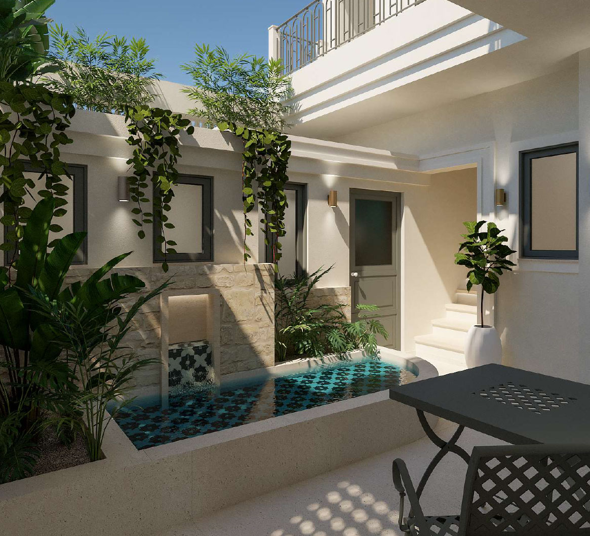
Un-Hotel Operations: We eliminated the classic reception desk and standard 10-meter buffets in favor of a calm welcome moment and bespoke gastronomy.
Hyper-Curated Filtering: Cratea acts as a filter against decision fatigue, suggesting only the 2-3 absolute best spots in the city rather than handing out a list of 40.
The Power of “Four”: The small scale is a deliberate feature, turning “spatial insufficiency” into the ultimate trigger for exclusivity.
Architecture
Brand System
We developed the complete Brand Naming ecosystem, focusing heavily on the concept of “quiet strength”.
The Brand Name
"Cratea" originates from Homer's Iliad. It symbolizes a presence that commands the space with absolute substance and devotion, rather than loud volume or excess.
The Suite Names
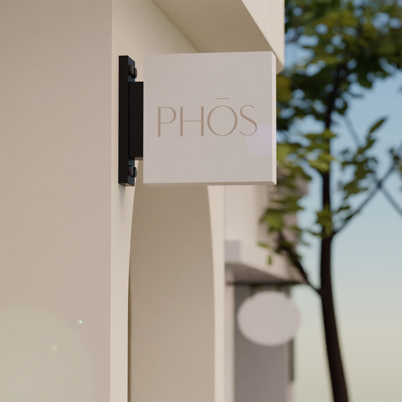
The four suites were named to reflect the brand's core philosophy: Ethos (character and true values), Kallos (inner, structural beauty), Phos (pure light), and Nous (mindful intent behind the design).
Archetype
The brand blends The Sage (filtering the noise with deep, curated knowledge) and The Lover (creating intense intimacy and sensory pleasure).
Brand Voice
Low-volume, slow, steady, and unapologetically confident. The brand never uses cheap tourist jargon like "VIP Experience" or "the best vibes," relying instead on elegant, grounded communication.
Curated Essentialism
Offering only what holds true value and heavily rejecting excess.
Invisible Care
Hospitality that is omnipresent and anticipates needs, but is never pushy or intrusive.
Unapologetic Exclusivity
Strictly protecting the peace of the guests; the adults-only policy is a sacred promise, not a restriction.
Visual Identity
The Branding Solution
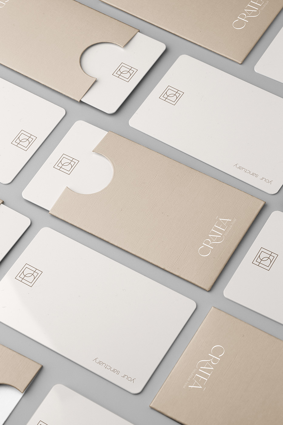
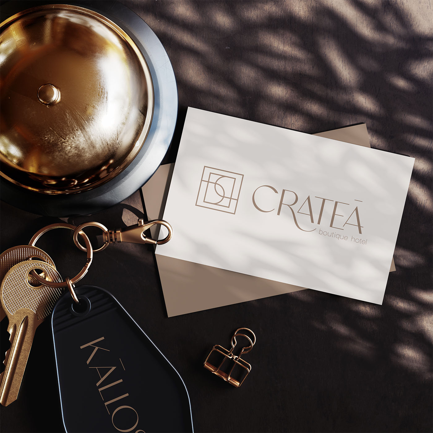
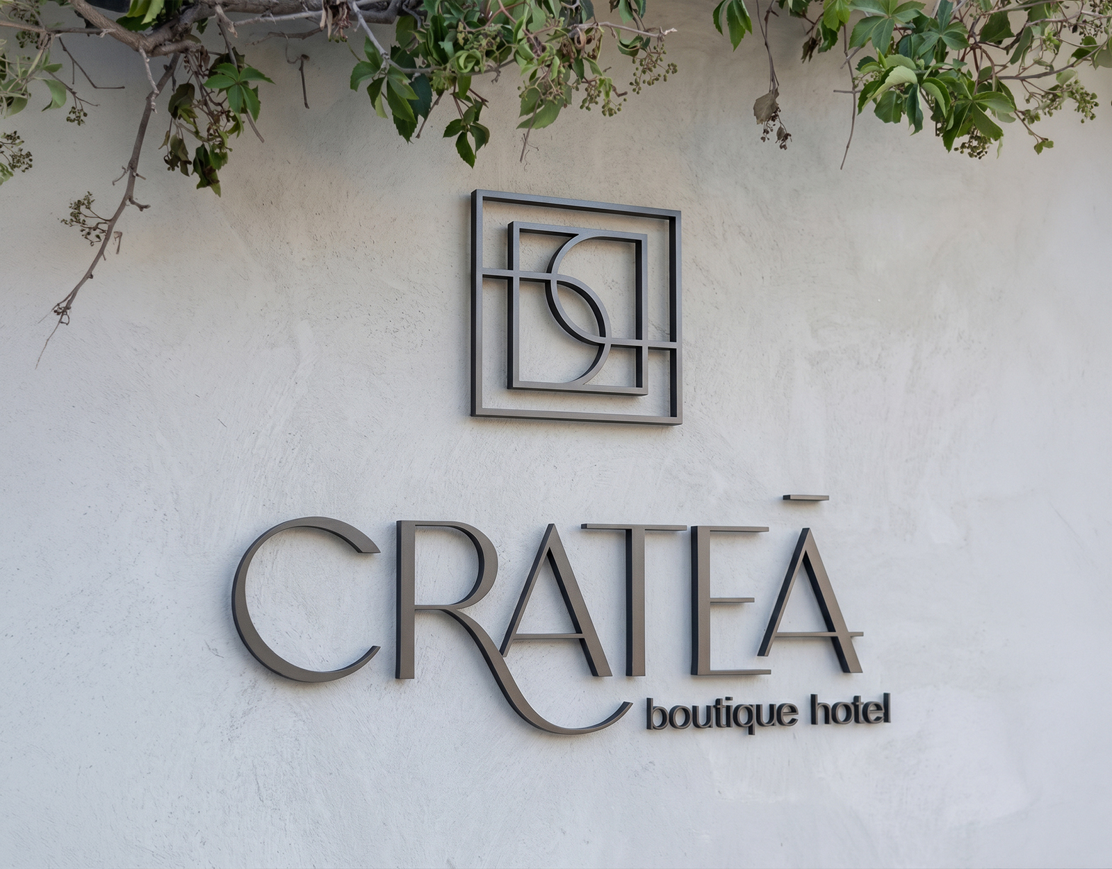
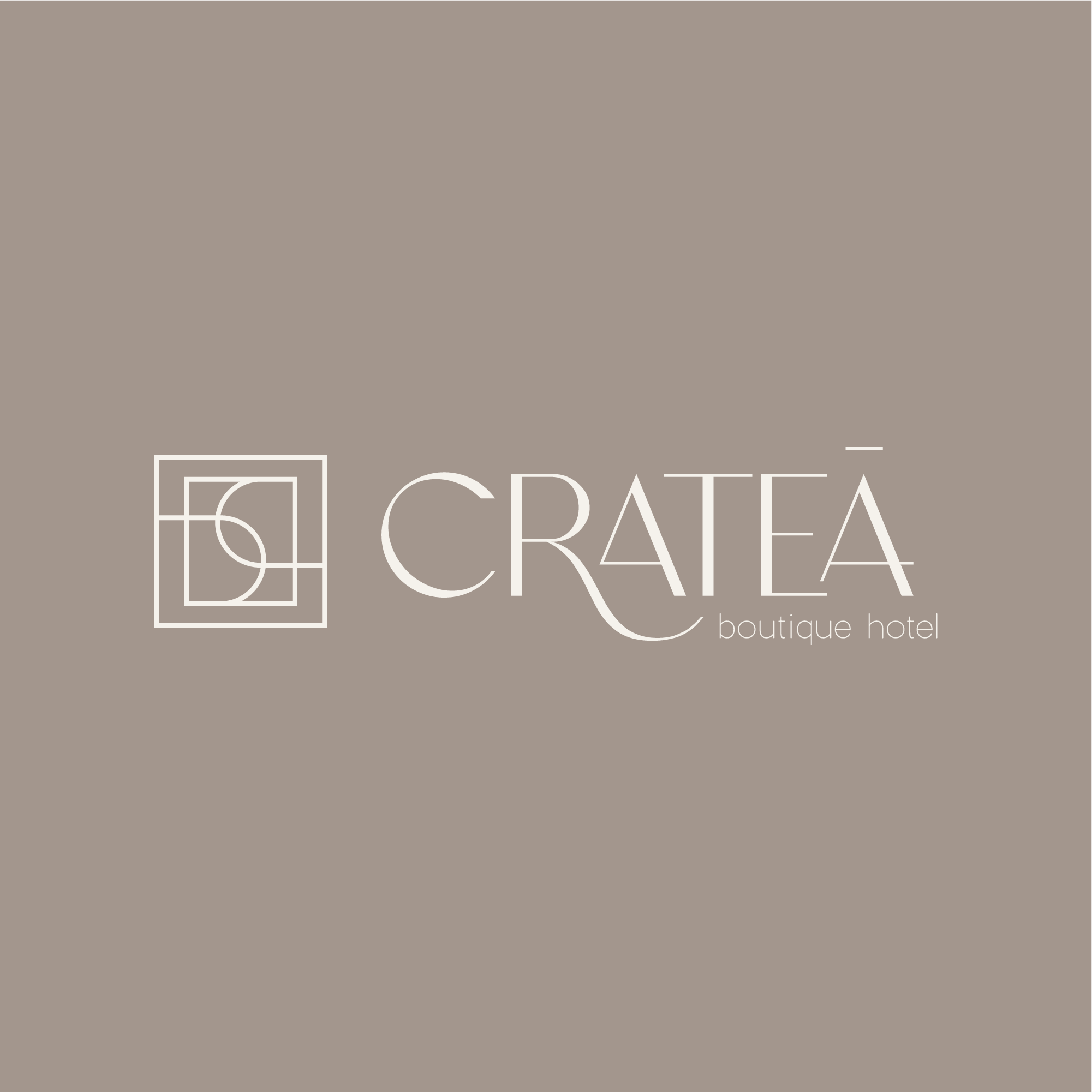
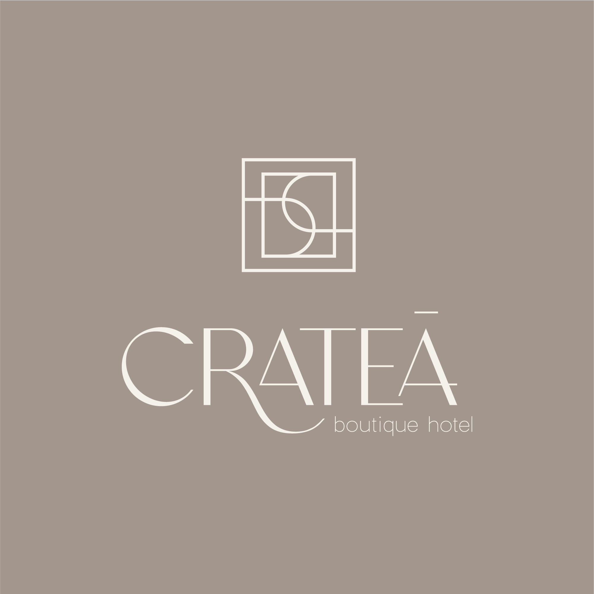
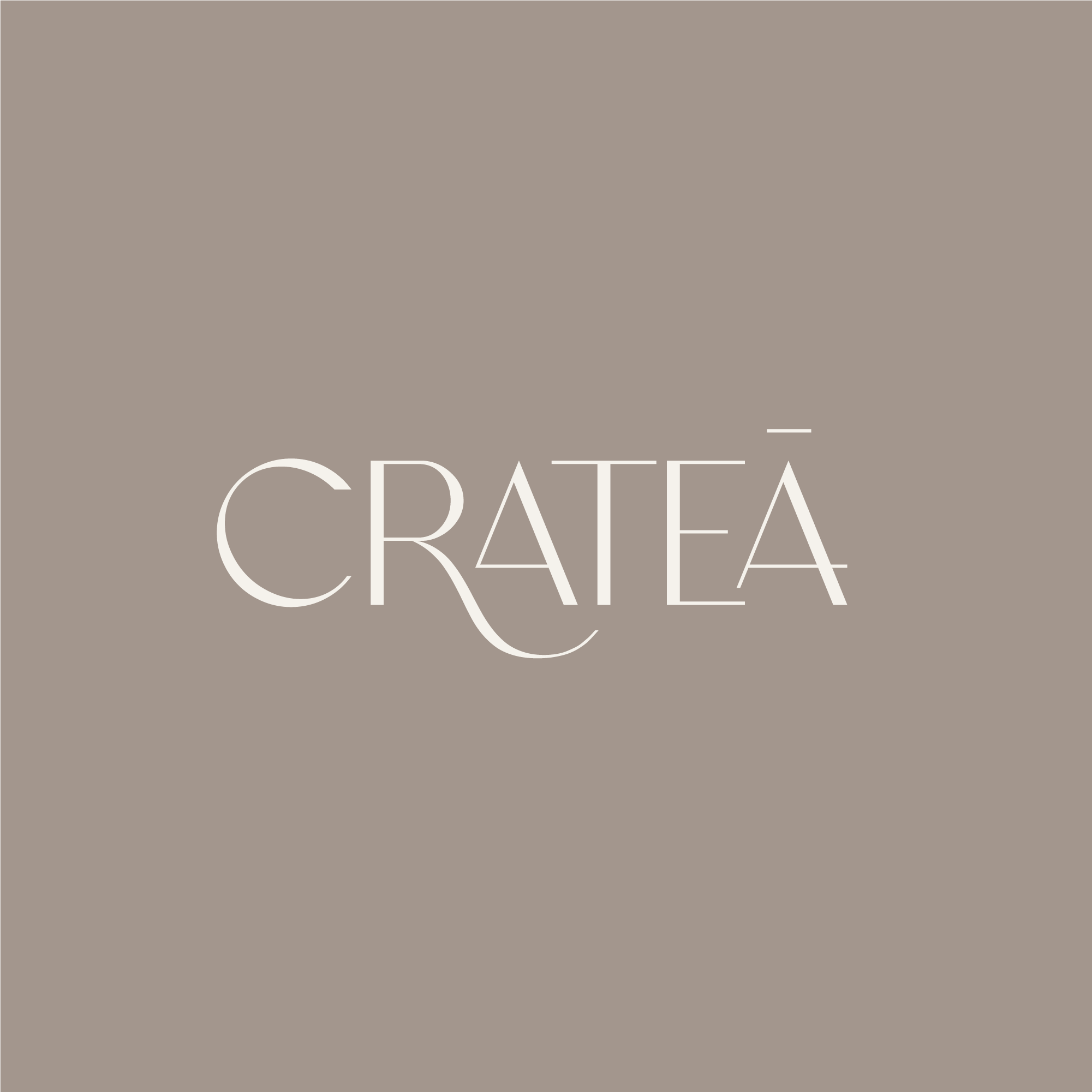
The new visual system acts as the “gate” to this sanctuary, visually embodying the “Art of Subtraction”. An elegant, interlocking geometric design that doesn’t rely on excess to impress. It utilizes a customized Chatoyer Regular font for the wordmark and a minimal Charlevoix Pro-Thin for the tagline.
The Hidden Monogram
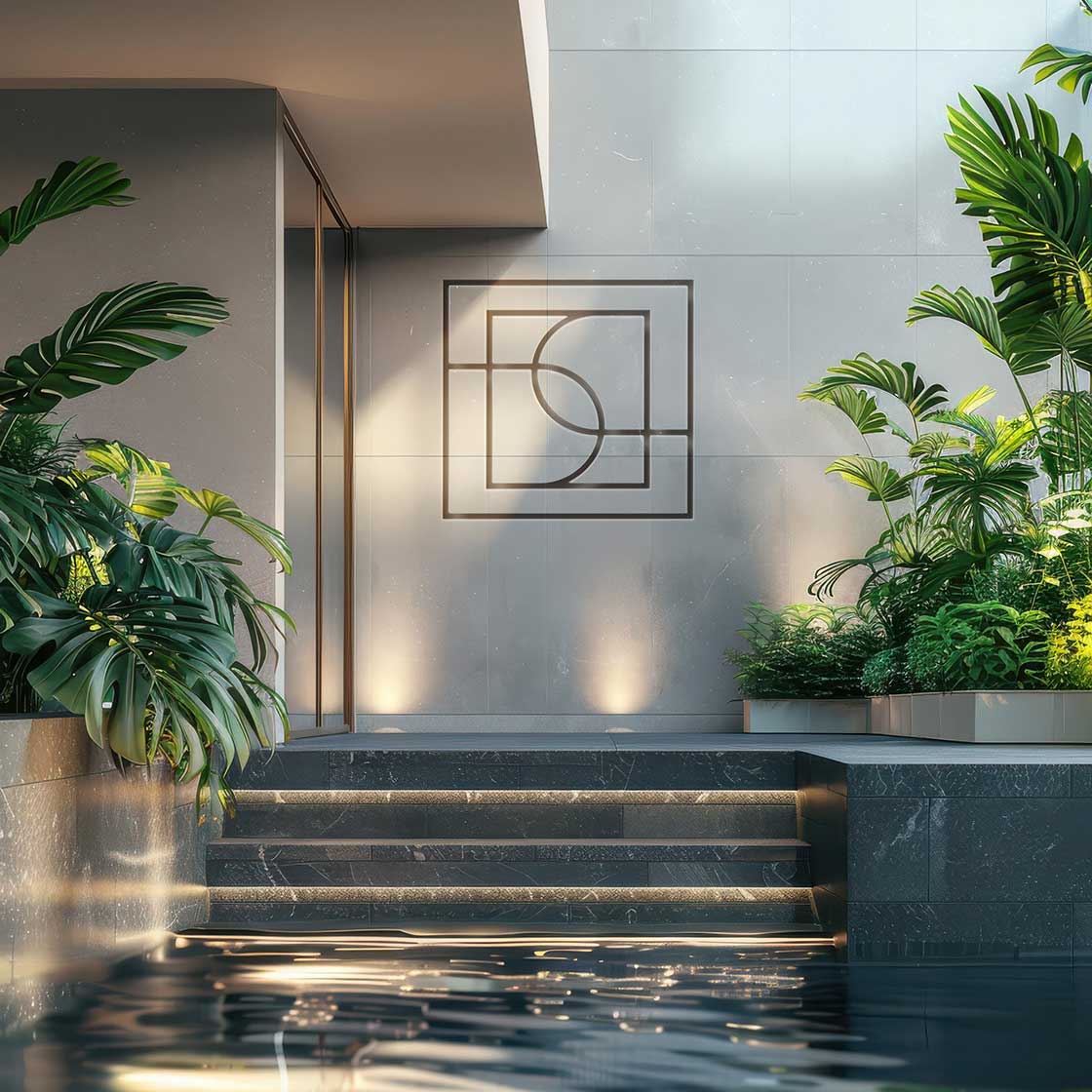
The sweeping, interlocking curves at the center of the geometric grid elegantly form a subtle, hidden “C” for Crateá, acting as a quiet signature without overtly shouting the brand name.
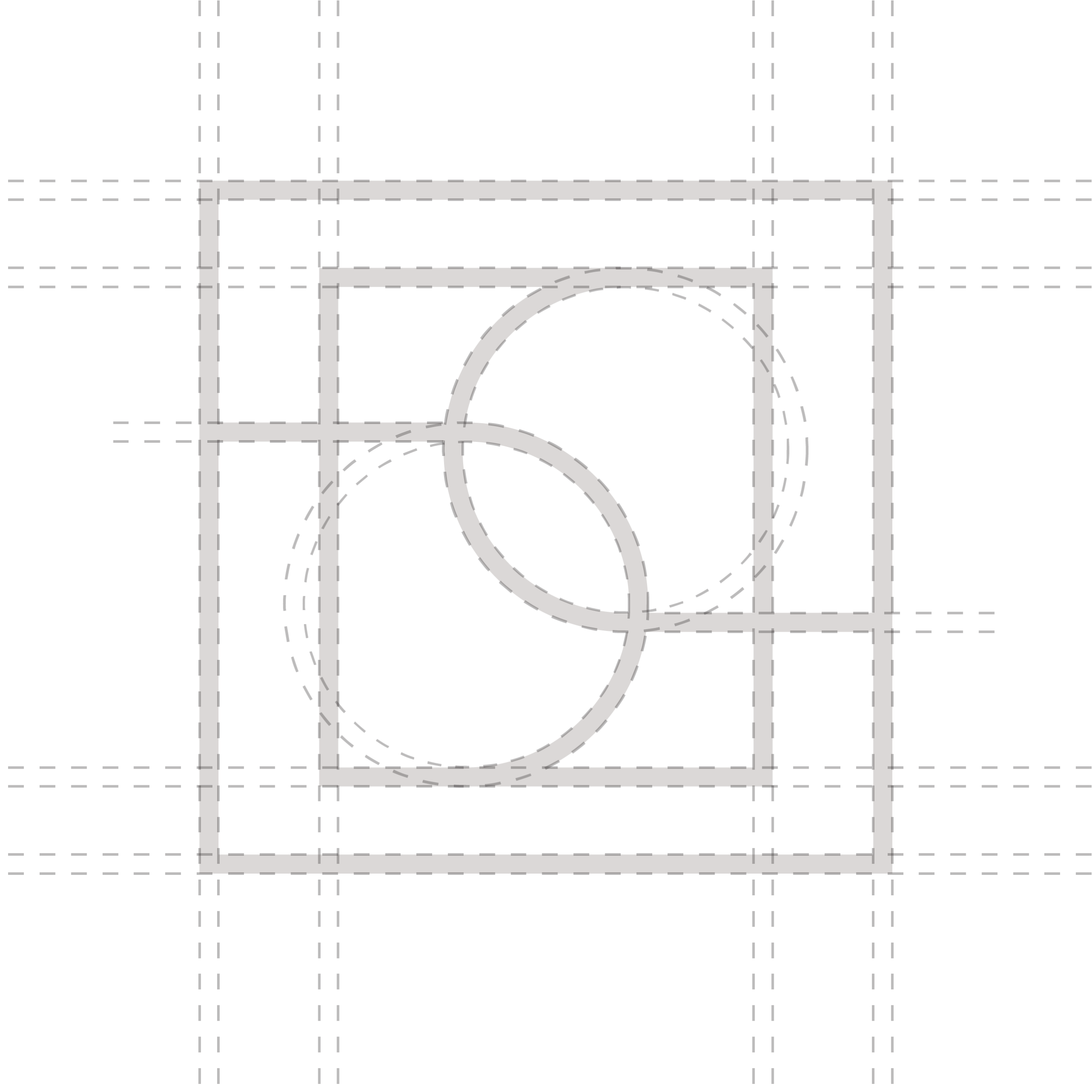
Architectural Heritage
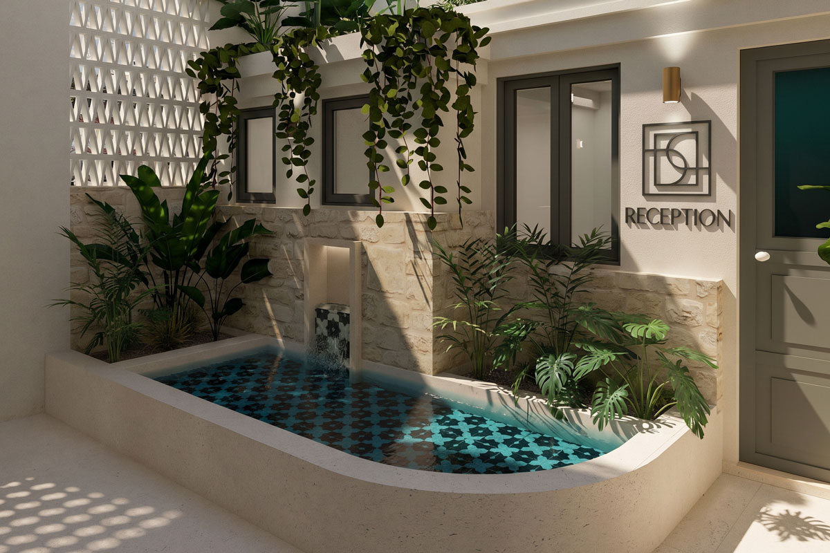
The strict square framing and intersecting internal lines mimic an architectural blueprint or a traditional Chania window frame, visually anchoring the brand to its “Tactile Heritage” and the structural beauty (Kallos) of the physical space.

Color Palette
A grounded, earthy mix of Warm Ivory, Taupe, Deep Mocha, and Champagne Gold. This reflects tactile heritage and raw textures over flashy Instagram clichés.
Warm Ivory
HEX | f5f2ec
RGB | 245, 242, 236
CMYK | 3, 3, 6, 0
Pantone | 9069 C
Taupe
HEX | a3968d
RGB | 163, 150, 141
CMYK | 38, 37, 42, 2
Pantone | 7530 C
Deep Mocha
HEX | 4d403a
RGB | 77, 64, 58
CMYK | 58, 62, 65, 48
Pantone | 7533 C
Champagne Gold
HEX | ceb180
RGB | 206, 177, 128
CMYK | 20, 28, 55, 0
Pantone | 873 C (Metallic)